The Best Examples of Email Marketing
Digital marketing is an interesting field in that many of today’s experts in the space never received a formal education in what they do. The rapid evolution of technology over the last two decades did not allow most of these skilled practitioners to wait for training courses, certificate programs or college majors to be developed in order to learn or do their jobs. Instead, they learned as the market demanded it. And whether or not you agree with Malcom Gladwell’s assertion that it takes 10,000 hours of practice to become an expert, one thing is for certain: when you learn your job on the fly, you need to look to other professionals for advice, technique and inspiration.
That is the theme of this post, which leverages a great resource for inspiration in email marketing, Really Good Emails. This site, which offers (in their own words) “the web’s best, and most attractive, curated collection of over 7,438 emails, showing off both design and code,” is a key resource for digital marketing and email professionals looking for inspiration, innovation ideas and examples provided by their peers to expand their horizons.
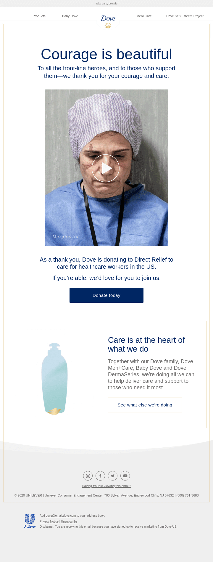
One of my particular favorites is this campaign from Dove. Much of our work in digital marketing, and especially email marketing, is dedicated to making a strong visual impression and overall theme that will resonate with our target audience. When I saw this campaign by Dove, I was immediately taken with their use of imagery to send a strong and emotional message with a clean, simple but impactful design.
Their team did a lot of things exactly right with this campaign:
- They kept the overall message simple and direct. As the reader, you immediately connect with what they want you to know as they evoke an emotional response.
- They used very powerful imagery. Dove has moved to campaigns that use more “real” people in recent years, and this has resonated well with their audience. They stay on brand with this campaign and use images that have great impact.
- They brought interactivity. The animated GIF, while simple, is a great way to add low-bandwidth excitement to a message.
- They linked to an excellent video. Audiences respond well to video campaigns, and in this case the click through does not disappoint.
- They align their brand with a great cause. It’s hard not to be impressed with the Herculean efforts of frontline healthcare professionals during a pandemic, and no matter how you feel about vaccines, masks or the politics of the situation, there isn’t a person living through this time that can’t get behind a charitable effort to help these people.
There are a lot of innovative campaigns where you can find outstanding examples of marketing prowess. My fellow Mailchimp Partners also found some excellent campaigns to draw inspiration from...
We have a collection on Really Good Emails called “Really Good Emails.” You can check it out here. I personally love the Allset emails we saved as the bold use of colour really makes them pop.
Doug Dennison, CEO & Co-founder
I love this email from Epic for Kids for several reasons. First, it starts with a benefit. Then it has a short supporting statement, and then a call-to-action. All of this is above the fold, so you'll see it immediately in any inbox. Following that is some fantastic creative with the book covers, presented at an angle and not just in a grid format so it's more visually appealing. The bottom of the email has two additional offers and CTAs, so recipients who scroll down can easily click through at the bottom of the message too. Overall the email is focused on generating conversions, and it does so in a way that is efficient and visually appealing for the recipient.
Adam Q. Holden-Bache, Director of Email Marketing

Oh how I love Really Good Emails! So much great inspiration. I love that when you sign up for a free account, you can “collect” emails you love into folders -- we have so many saved.
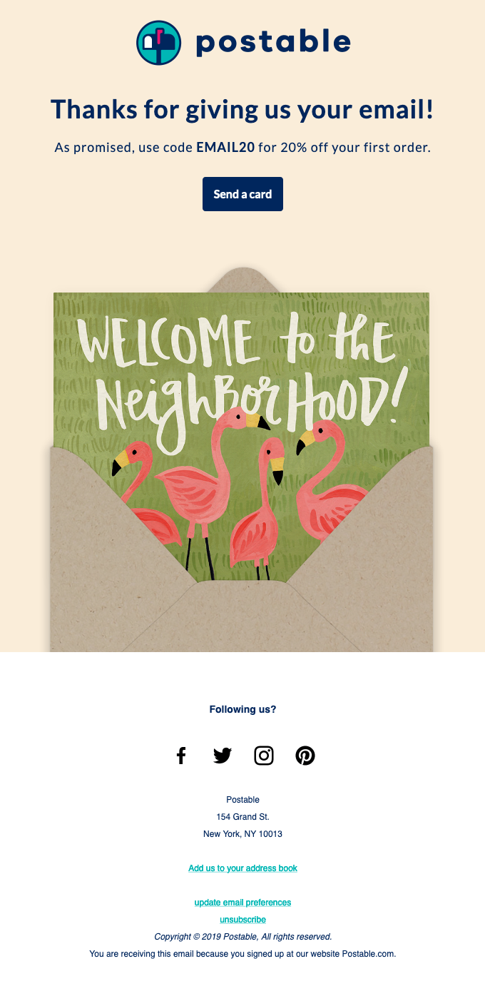
If I had to choose, I am a huge fan of the emails from Postable.com, an online greeting card service (that I happen to use often). What I love most about their emails is that they make the offer VERY clear and it’s always at the top before the graphic. They’re very simple, but catchy and fun and I bet they convert very well. Here’s their welcome email which I love.
And their animated “your card was mailed” transactional email is another favorite. Who wouldn’t love to get this...
Emily Ryan, Co-Founder and Email Strategist
This is one of a series of onboarding educational emails (you can see more here) and I like it because onboarding subscribers by teaching them something is one of the best ways to initiate a habit of opening, actually reading and clicking your emails, so avoiding irrelevance and being trapped in the Spam folder.
Moment sells camera bags and gear, and its welcome series is full of tips to shoot better pictures and movies, create social media posts, and choose and use accessories and apps. By educating subscribers, Moment staff show expertise and willingness to help; the email itself is simple but graphically nice; text is clear, well organized with clever use of subtitles and bullet lists to organize concepts.
Alessandra Farabegoli, Digital Strategist, Co-Founder
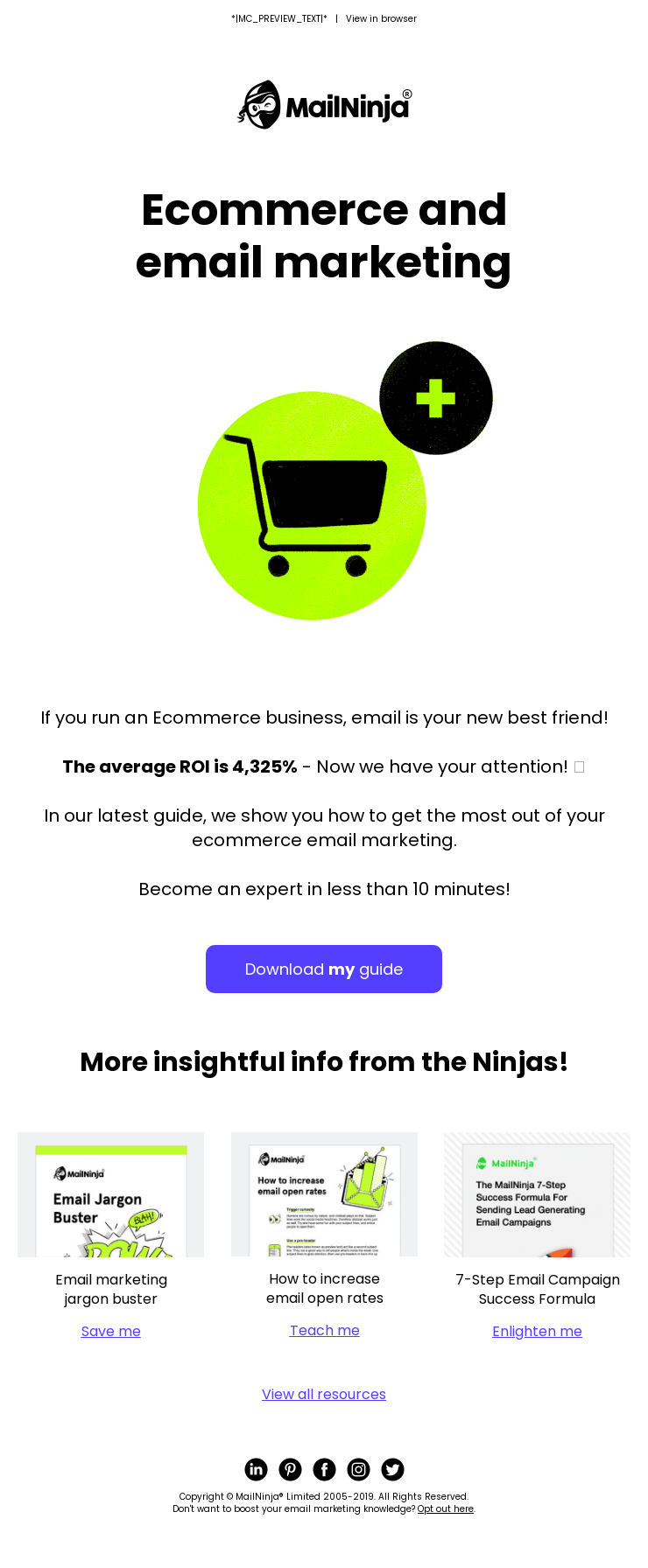
 This is a cool little email that stood out for me in the sea of e-commerce emails on reallygoodemails.com. It's awesome because it has a clearly stated subject - Ecommerce + Email Marketing = $$ - that it sticks to throughout the email.
Like Really Good Emails says, I also like the combination of a smart gif with a simple, clear call to action on a button that stands out - Download my guide.
The Mailninja's then have a backup of more excellent content that works with the guide. I really like the directness of the download links too. "Save me," "Teach me," and "Enlighten me" give the reader a clear indication of what action to take and what action will happen if they click the link.
The fun Mailninja's have with their design and copy is front and centre in this email. One of their best to date.
Glenn Edley, Director & Email Strategist
Really Good Emails is great to “dip” into, but like most things, if you don't know what you're looking for, it can become a bit of a mindfield.
I usually like checking out Welcome emails. Mostly because a lot of stuff we do is focused on that area.
One that recently caught my eye was for GFDA. If you're offended by profanity, then it's not for you, but it's big, bold, and brassy and clearly shows what their brand is about (which will further endear them to their audience). It's got actions to take and clicks to make…
...and I love their footer... in fact I think I might use it as inspiration!!!
Robin Adams, Founder
I love this email! Simple and clean in its messaging. I love the image in the header area. It clearly gives you an idea of what the email is about: a streaming device, phone and Google home speakers. Not only does the text say that you'll learn about their latest offerings but the image mirrors that message. So 2 messages in one! This email is a bit like a website in that it has a call to action at the top of the email in the large hero image.
Amy Hall, Email Marketing Strategist and Certified Mailchimp Partner


